Howard Wainer *68 and Michael Friendly *71 Give Data Meaning
The longtime friends penned a book on the history of turning numbers into images

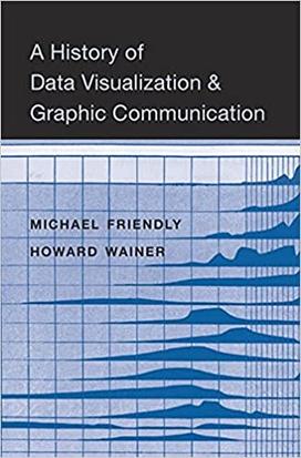
Fifty-nine years after becoming friends, they have co-authored A History of Data Visualization & Graphic Communication. The book has won raves from scholars, one of whom says Friendly and Wainer are “the Watson and Crick of statistical graphics” because like the famed DNA scientists, their work traces the building blocks of visual problem-solving.
“This book is the culmination of decades of my work and Howard’s in separate streams, all of which channeled towards this. We wanted to provide a narrative for people to understand why and how graphical methods developed,” says Friendly, a professor of psychology at York University in Canada and founding chair of its quantitative methods area. Both he and Wainer are fellows of the American Statistical Association.
They tell how a handful of scientific pioneers — Friendly calls them “the heroes of visual thinking” — transformed dry, cryptic numbers into instantly understandable images. “The visualization of data is an alchemist that can make good scientists great and transform great scientists into giants,” they write.
These little-known groundbreaking figures include Scotsman William Playfair, who in the 1780s invented the bar chart, the line graph, and the pie chart — advances so astounding that King Louis XVI said, “They speak all languages.” When cholera ravaged London in 1854, physician John Snow’s dot map revealed deaths clustered near a public water pump. The image made it clear that the disease spread via contaminated water, not bad air as previously assumed.
Fast forward 120 years, and Wainer and Friendly report a high-tech version of a similar story: Stanford researchers used a mainframe computer and PRIM-9, a system for “Picturing, Rotating, Isolating, and Masking in up to 9 dimensions,” to create 3D images which helped prove the distinction between Type 1 and Type 2 diabetes.
The duo became friends in 1962 when they were undergraduate math majors together at Rensselaer Polytechnic Institute.Their shared interest in data depiction caught fire when Wainer studied under John Tukey *39, the chair of Princeton’s statistics department.
“Tukey changed modern science. He believed the goal of data analysis is insight, not numbers. He believed ‘the greatest value of a picture is when it forces you to see what you were not looking for,’” says Wainer, who was a principal research scientist at Educational Testing Services and a distinguished research scientist at the National Board of Medical Examiners. He was also a professor of statistics at the Wharton School of the University of Pennsylvania.
Collaborating as co-authors tested their six-decade friendship. “We had a friendly competition where one person wrote a first draft of a chapter,” and then the other person got to critique it, says Friendly. “We went back and forth this way and managed to stay friends, though that’s not to say that there were not rocky times.”
He looks forward to working on the book’s second edition, which he says will include a chapter explaining how visual presentations of COVID statistics sometimes have led to confusion among laypeople. “That’s not the fault of the visual scientists,” he says. “It’s a fundamental problem in the communication of complicated results that can have many interpretations to an audience that in some cases doesn’t believe this is real at all.”
Wainer laments that data depiction today lags behind technological advances. It’s easy to plot data points on custom charts with high-level software, he says. “But good taste in drawing them hasn’t kept pace with the ability to make them. So you still get the same crappy pie charts. We need fewer cookbooks on how to draw graphs and more guides to gastronomy telling us what graphs we should draw,” he says.
Statistics has in recent years become a trendy field, partly thanks to celebrity political pollsters like Nate Silver. Wainer has mixed feelings about his profession’s new hip status. He once took “great joy” when passengers on an airplane shunned him after learning he was a statistician. Today, people don’t even call it statistics, but “data science,” he says.
“Now when I get on a plane, my serenity is ruined. ‘What do you do?’ people ask. ‘I’m a statistician.’ ‘Oh, that’s way cool. What do you work on?’”
Visit Wainer and Friendly’s website for classic charts and graphs from the 1600s to the present.


No responses yet