
PAW's New Look


When a new editor arrives at a magazine, a redesign usually arrives soon after.
But PAW, like Princeton, is not known for rushing headlong into change. And so it is only now — a decade into my tenure — that PAW has been redesigned.
We consider this as part of an evolution, not a revolution, in PAW’s look and content. In the magazine world, a decade is forever; the advent of online media has changed the way people read and gather information. Surveys we conducted every few years suggested that we needed to do more to appeal to younger alumni without alienating the baby boomers and older readers who have been so loyal to the magazine. Designers at Pentagram in New York came up with an updated look that we think respects tradition at the same time.
The changes begin with our cover. The back-to-basics nameplate recalls one that was used in the past and states proudly who we are: We’re Princeton, and we’re alumni. (True, our print issue no longer comes out weekly — while our website, Facebook, and Twitter feeds are updated far more often than every seven days — but the name is our brand.) Pentagram provided a wide range of options for our cover; alumni at informal focus groups overwhelmingly preferred this look.
Inside, we took survey results to heart and expanded coverage of Princeton research by creating a new section called Life of the Mind and a back-page history feature called That Was Then. Campus news and sports run in the On the Campus section, which always will begin with a full-page campus scene — the same kind of beautiful image that ran at the back of the magazine in the recent past. Alumni news comes together in a section called Princetonians. We aimed to make the layout of Class Notes (page 52) cleaner, with a typeface that is easier to read. (The length of class columns has not changed.)
We previewed our work with alumni in Princeton and Washington, D.C., as well as with the various Princeton committees that consult with PAW. The alumni offered suggestions — some wrote reactions on sticky notes — and we considered each one. In response, we changed fonts, improved legibility, altered section names, and reinstated some of the particulars that make PAW, well, PAW. We are grateful to Luke Hayman and Regan Johnson at Pentagram for providing a wonderful design and accommodating our peculiar requests, often relating to the color orange. PAW art director Marianne Nelson, who always makes the magazine look good, was a true partner, serving as a bridge between Pentagram and our word-oriented staff.
As you will see in the following pages, many of the details of PAW have changed. But at its core, PAW is the same. PAW is your magazine. We have the same mission, and we hope to carry it out better than ever. In the months ahead, let us know how well we succeed.

The Latest
See all


Related News

These Three Tigers Are Working to Elevate Pro Women’s Lacrosse
WLL players Marge Donovan ’22 and McKenzie Blake ’25 and executive Rachael DeCecco ’03 see big potential in a new league
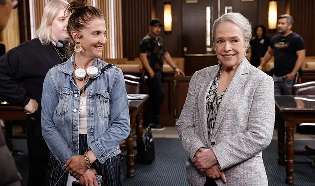
Screenwriter and Producer Jennie Snyder Urman ’99 Brings Bold Women to the Screen
Urman’s fingerprints are on Gilmore Girls, Jane the Virgin, and most recently the Matlock reboot
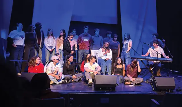
Songwriting Class Is a Princeton Atelier Tradition
Laura Hwa ’26 estimated that she and her classmates collectively wrote around 70 songs this spring
No responses yet